Ferdy wrote:Fritz GUI can be customized. You can remove/add boxes, logos, clock etc. according to your needs.
Well, according to my taste that is much, much better. I stil think the top part of the kibitzr windows is quite ugly, though, while most info in it seems redundant. Not to mention the silly blue squashed arrow in the right margin of the first one. Same for the header in the Notation tab, which just duplicates info that is already in the main title bar. (And leaves the title bar of its own window unused.) Also not clear why the info in the Openings Book window is duplicated in a header. Is this just to better fit in the distracting pictogram of a tree? Smaller font size in there for the book name and data below is also pretty ugly.
So I cannot really say I have seen any other GUI that looked worse (although Arena comes close). But at least it doesn't make me puke anymore.
Of course configurability is good. Tastes differ, and it is impossible to cater for all tastes at once. This is also what I like about WinBoard; you can change board, pieces, fonts any way you like it, and open, close ad tile the windows for the various outputs at will.
The blue arrow at right margin is when you disconnect from Lets Check feature. Here it is connected.
The explanatory popups are definitely a very nice features. I built a similar 'instant help' functionality in XBoard, where right-clicking on any dialog item or menu item would pop up a notice with the corresponding paragraph of the manual.
This goes a bit beyond 'attractive look', however; it is a whole new feature.
The menu 'ribbons' are a total mess, however, the name of all items chaotically spread over a huge area, sometimes as one line, sometimes split into two lones, with completely meaningless pictograms of different sizes, sometimes above the text, sometimes left of it. In some cases the 'pictogram' actually seems a checkbox, that you can tick...
If I would rate the WinBoard main menus as 7 out of 10, I would rate this as 2, in terms of attractiveness.
I was pretty sure that blue squased arrow had some function. The point is that to put it in that location with that shape is extremely ugly. Hard to imagine a worse place and shape for it.
I am somewhat neutral as to whether separating a "board" menu from the "view" menu is good or bad. To change anything on the look of the board "view" would be the obvious place to look, in absence of a "board" menu. I would certainly not look for opening-book stuff in an "Analysis" menu.
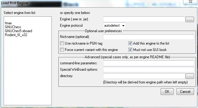
I have tweeked the design of WinBoard's Load Engine dialog a bit, so that it should appeal more to idiot users. The new design replaces the checkboxes for protocol choice by a single combobox. This now also has 'autodetect' as an option:
Given that there now is autodetect, I am in doubt whether the protocol selector should be moved to the Advanced group box or not.
I am still thinking about whether it would be useful to put a number of buttons at the bottom, for organizing the listbox (e.g. Up, Down and Delete buttons)
hgm wrote:I have tweeked the design of WinBoard's Load Engine dialog a bit, so that it should appeal more to idiot users. The new design replaces the checkboxes for protocol choice by a single combobox. This now also has 'autodetect' as an option:
Given that there now is autodetect, I am in doubt whether the protocol selector should be moved to the Advanced group box or not.
I am still thinking about whether it would be useful to put a number of buttons at the bottom, for organizing the listbox (e.g. Up, Down and Delete buttons)
The "(optional)" is already scheduled for deletion. But this will break all translations, if I don't adapt the English message in the language files, and until I have time to do that, I wanted to leave it in as a reminder.
Idiots should certainly stick to operating the green button. But the directory field is in the 'Advanced' group box, which is supposed to keep the idiots out. It is relatively common that engine executables exist in a "bin" sub-directory in their distro folder, separated from their support files (such as settings and book).
"Engine parameters" is stead of "command-line parameters" is a good idea.
I think that indeed protocol selection should move to the Advanced section, now there is auto-detection. Idiots should always use the latter.
Why do you think "Must not use GUI book" is an "Advanced" setting? Even an idiot user is supposed to know what "opening book" or "GUI" means. If there is doubt about the latter, the message could be changed to "Must not use the common book". In addition it is not possible to wreck anything, no matter what setting you choose; it just might not do exactly what you want because it would do what you asked for.
I don't think "Set up the engine" is very clear. If a change is needed I would prefer "Or select a new one:".
The "If specified" seems a bit superfluous. Even an idiot should understand that you cannot use something that is not specified. Potentially you could add "If specified" to any entry in any dialog ("Engine (.exe), if specified"). If you think it is not sufficiently clear that 'nickname' in the checkbox refers to the 'Nickname' in the text entry, the text could be altered in "Use the above nickame in stored games".
As to explicitly showing the "current variant". It seems usually the user would know what variant he is in (even if that this is just that "he is playing no variant"). Remember this dialog will not be the only thing he is seeing; the main window would still be visible behind it, and the variant indication could come from there as well. If we want to go out of our way here, the message itself could be made into "Use for %s only", where %s is the variant name. And then disable (or hide) the checkbox if the current variant is 'normal'.
It doesn't seem wise to remove the "Add this engine to the list" if there would not at least a method provided to delete an engine from the list (E.g. a button "Delete Engine"). Otherwise the only way to control list pollution would be to edit the engine list, which starts to look more and more cluttered now that it is also used for storing the engine-option settings. The advantage I can see is that the Delete Engine button would be more flexible, as you can also use it to delete obsolete engines from the list. The downside is that it requires you to re-open the engine dialog, select the engine you just was forced to install against your wishes, press the button, and then 'cancel'. Perhaps one could argue that this happens infrequently enough that it doesn't add much work on the average. But it never saves anything, the 'upside' is purely cosmetic. Eventually this approach would lead to an extra groupbox "List Management" with buttons "Delete", "Move Up" and "Move Down" at the bottom of the dialog.
Why do you want to shorten the groupbox names to just one word? This seems more cryptic. I considered the word "preference" more to the point tha "optional" anyway; most of the settings are always there, what is optional is to change them from their defaults. Perhaps the title should be changed to "Preferences for use with this engine" or "Settings to use with this engine". (And the variant checkbox then simply the variant name.) As to "Advanced": do you really think that this single word is enough to deter idiot users from messing with it? The reminder that engines might be accompanied by something like a README file does't seem wasted on most people.
It doesn't seem very different in philosophy from XBoard: just show the board, and a narrow horizontal strip of additional info. The difference is in what additional info exactly you want shown. The Go GUI doesn't show any PV; one assumes that it is mainly intended for human-human games, or just game editing. It also shows no clocks. I don't think the way XBoard shows clocks (and side to move) does make it look less elegant. One assumes that in the Go GUI it has to be deduced from the last move marker who is on move. (Which seems strange in Go, as you are allowed to pass your turn there...)
The Go GUI hides the main menu bar, or at least reduces it to a button. This might be a good idea. It has become somewhat of a standard nowadays to not show menu bars by default, but only after pressing of the Alt key. In XBoard there also would be the possibility to patch it such that the menu bar only appears when the mouse gets close; the presence of the clocks guarantees that you never need to be close during normal operation of the board. I think I even made a version once that did this. I did not consider that a complete success, as opening the menu bar would push everything down, making it distinctly 'unquiet'; I would have preferred if it would just partly cover the clocks. (But that was not feasible in the GTK widget set.)
It could be that in some themes of newer window managers this is even automatic; I noticed that recent Ubuntus tend to hide the menu bar, and overlay it onto the widow title bar when you hover the mouse over there.