Elements of the ULTIMATE Chess GUI?

Discussion of anything and everything relating to chess playing software and machines.

Moderator: Ras

Fulvio
Posts: 399
Joined: Fri Aug 12, 2016 8:43 pm

Re: Elements of the ULTIMATE Chess GUI?

Post by Fulvio »

hgm wrote:'Extra here means nothing else than "what they don't happen to need, for their limited interests". If that is not what you understood from it.
Let me quote myself again, maybe you'll learn to think about different points of view before replying:
Fulvio wrote: but the program should "ask" only the necessary information
User avatar
hgm
Posts: 28519
Joined: Fri Mar 10, 2006 10:06 am
Location: Amsterdam
Full name: H G Muller

Re: Elements of the ULTIMATE Chess GUI?

Post by hgm »

Fulvio wrote:Your first thought should be to start 2 different sub-process in parallel, one for UCI and one for xboard, and just kill the one that do not respond (or the one that you think is inferior for multi-protocol engines).
This certainly is an idea worth consideration (thx), but I also see some dangers. E.g. if the engine you try to launch by default tries to grab almost your entire machine's memory. Cores are not the only thing to consider (starting up a program is usually not CPU-intensive anyway, it is more a disk-i/o thing).

Because I run non-WB engines through a protocol adapter, it would certainly make life a lot easier to launch one process with adapter, and the other without, and then kill one. If an engine started directly would turn out to respond to 'uci' I could not use it anyway, but would have quit it, and start the adapter instead. The adapter should detect non-response to 'uci' in that case, and communicate that to the GUI (e.g. through "telluser this does not seem to be a UCI engine"), which in the auto-detect phase would prompt the GUI to send it a 'quit' command, and continue with the other process.

When the egine that got the 'protover 2' command responds with features, the proces with the adapter can get a 'quit' immediately. (Do UCI engines reliably accept 'quit', or are there that hang when they do not receive an 'isready' first?)

When 'feature done=1' is received from the UCI adapter, and there is no response within a reasonable time (say 1 sec) to 'protover 2' in the direct process, the engine can be assumed to be UCI only. A 'quit' can then be sent to the direct process, and the I/O channel for the adapter process would somehow have to be transferred to that of the direct process (i.e. what used to be considered engine #3 should now be considered engine #1 or 2).
User avatar
hgm
Posts: 28519
Joined: Fri Mar 10, 2006 10:06 am
Location: Amsterdam
Full name: H G Muller

Re: Elements of the ULTIMATE Chess GUI?

Post by hgm »

Fulvio wrote:Let me quote myself again, maybe you'll learn to think about different points of view before replying:
Fulvio wrote: but the program should "ask" only the necessary information
That is a completely useless statement, when the GUI cannot possibly know what is necessary and what not, in the case at hand...

Or, in another view, it is simply not true. The program should ask for everything that might be necessary to do the job. Otherwise there will be cases where it fails to do the job.

Another problem is that you seem to have a funny notion for what "asking" means in the context of a UI. Which leads to these false restaurant analogies. When you deal with waiters, there is a profound difference between them 'asking' you stuff, and them 'listening' to information you might volunteer. 'Asking' compells you to give an answer, 'listening' doesn't compell you to say anything, but will take note of it when you do.

That is not different in a UI. There are things you must obligatorily do in order to proceed (such as clicking 'OK' or 'cancel'), and there are things you can completely ignore and it would only speed up progress, but the UI is still paying attention if you volunteer something. This is what makes your restaurant analogy of the Load Engine dialog so silly. In practice the waiter is not asking anything at all, other than "that's it?" ('OK') at the end. One could argue that it should at least compell you to provide an engine name, (i.e. ask "what would you like to order?"), by disabling the OK button as long as that text entry is empty. But that is a bit of a moot point, as in practice not even an idiot would try that.
Ferdy
Posts: 4856
Joined: Sun Aug 10, 2008 3:15 pm
Location: Philippines

Re: GUI and features

Post by Ferdy »

hgm wrote:
Ferdy wrote:Here is the page and some entries so far.
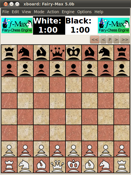
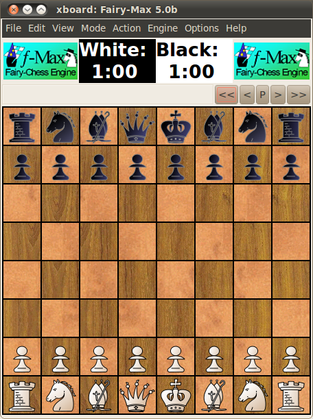
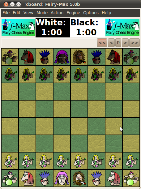
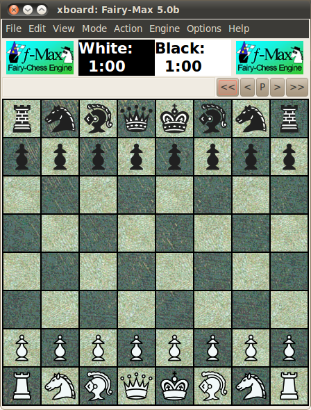
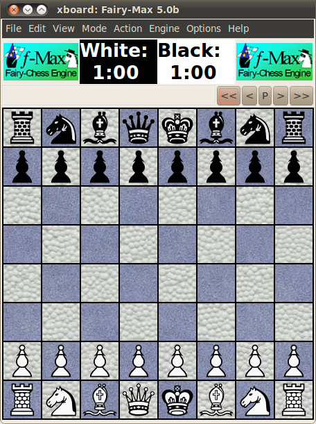
Of course I am very pleased that you rate WinBoard/XBoard so well on most counts. At the risk of seeming greedy, though: I am a bit puzzled that you rate the piece and board graphics only 6 out of 10. Because these are nearly infiitely configurable. E.g. for XBoard several dozens of piece themes are available, from the very conventional (like Alpha or Meridia) to the extreme. There also is the choice of nearly 100 square textures. Some examples:

Image
Condal

Image
Leipzig

Image
Kilfiger

Image
Fantasy

Image
Freak
What I had in mind for attactive design - board and pieces is about the overall look of the GUI. Right I change the rating of this feature to 10.

Added Graphic category: Attractive design - overall view
Not sure about its exact name, but something like below image. I rate Fritz as the highest at 10.

Image
User avatar
hgm
Posts: 28519
Joined: Fri Mar 10, 2006 10:06 am
Location: Amsterdam
Full name: H G Muller

Re: GUI and features

Post by hgm »

This is extremely subjective. The image you show above looks absolutely awful to me, to the point where it hurts my eyes to look at it. I would probably rate it one of the worst. Way too crowded.

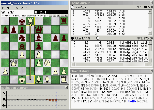
I do see a lot of red squares with crosses in the various sub-windows, so I suppose these can be closed to ameliorate matters. Which is good, as I see a lot of stuff that would not be relevant to me, while other stuff (clocks, engine logos) seems to be missing. So perhaps it is a consequece of opening too much at the same time, so that my opinion would be more favorable if it was configured for a particular application, say an engine - engine game. What I consider attractive is a quiet, minimalistic design with as few distracting elements as possible. Something like:
Image

It has what I want to see, (board & clocks, engine ID, analysis and game navigation) and nothing else.

Specific things that for me count as a big minus are:
* The 'ribbon' along the top, which seems to have the function of a main menu, but selectable by tab rather than as a pull-down menu. It is cluttered with totally non-informative pictograms (of very inhomogeneous size). Just listing the explanative text in a small table, as a conventional pop-down menu would do, would already be enormously better.
* Much space wasted around the board, seemingly for no other purpose than fitting the bar of navigation buttons. That it can look nice to have a rim around the board (where you could for instance write the board coordinates), OK. WinBoard you can optionally do that too. But this doesn't look like a board rim at all, just like a board asymmetrically nailed to a wall. And it doesn't even seem room to show square coordinates.
* The buttens in the navigation bar are too conspicuous, and the pictograms on them non stadard. I have no idea what the blue curved arrow could mean.
* The engine names in the kibitz windows are written both in the window title bar and in the window directly below it. What's the point of that? Depth, score and move are written both at the top and at the bottom within the window. The way it is written at the top is ugly; it makes the window look inhomogeeous/irregular.
* The Notation - Openings Book window also has such an inhomogeneous header inside it; this seems a general design theme of this GUI that I don't like. It seems that the info there could have been easily put in the title bar, which seems now just to contain a fixed text. (Which, incidentally, doesn't see much to the point.)
User avatar
Evert
Posts: 2929
Joined: Sat Jan 22, 2011 12:42 am
Location: NL

Re: GUI and features

Post by Evert »

hgm wrote:This is extremely subjective. The image you show above looks absolutely awful to me, to the point where it hurts my eyes to look at it. I would probably rate it one of the worst. Way too crowded.

I do see a lot of red squares with crosses in the various sub-windows, so I suppose these can be closed to ameliorate matters. Which is good, as I see a lot of stuff that would not be relevant to me, while other stuff (clocks, engine logos) seems to be missing. So perhaps it is a consequece of opening too much at the same time, so that my opinion would be more favorable if it was configured for a particular application, say an engine - engine game. What I consider attractive is a quiet, minimalistic design with as few distracting elements as possible. Something like:

Image

It has what I want to see, (board & clocks, engine ID, analysis and game navigation) and nothing else.

Specific things that for me count as a big minus are:
* The 'ribbon' along the top, which seems to have the function of a main menu, but selectable by tab rather than as a pull-down menu. It is cluttered with totally non-informative pictograms (of very inhomogeneous size). Just listing the explanative text in a small table, as a conventional pop-down menu would do, would already be enormously better.
* Much space wasted around the board, seemingly for no other purpose than fitting the bar of navigation buttons. That it can look nice to have a rim around the board (where you could for instance write the board coordinates), OK. WinBoard you can optionally do that too. But this doesn't look like a board rim at all, just like a board asymmetrically nailed to a wall. And it doesn't even seem room to show square coordinates.
* The buttens in the navigation bar are too conspicuous, and the pictograms on them non stadard. I have no idea what the blue curved arrow could mean.
* The engine names in the kibitz windows are written both in the window title bar and in the window directly below it. What's the point of that? Depth, score and move are written both at the top and at the bottom within the window. The way it is written at the top is ugly; it makes the window look inhomogeeous/irregular.
* The Notation - Openings Book window also has such an inhomogeneous header inside it; this seems a general design theme of this GUI that I don't like. It seems that the info there could have been easily put in the title bar, which seems now just to contain a fixed text. (Which, incidentally, doesn't see much to the point.)
+1
(I would guess that the blue arrow is an "undo"/"take back" button, which I sometimes miss in XBoard).

Of course it depends very much on what you want to do. If you're looking into different variations in an analysed position, you want the variations to be prominent and the board can be smaller (in fact you may want several). Normally, I want the board to be the most prominent, which means as large as possible.
Ferdy
Posts: 4856
Joined: Sun Aug 10, 2008 3:15 pm
Location: Philippines

Re: GUI and features

Post by Ferdy »

hgm wrote:This is extremely subjective. The image you show above looks absolutely awful to me, to the point where it hurts my eyes to look at it. I would probably rate it one of the worst. Way too crowded.

I do see a lot of red squares with crosses in the various sub-windows, so I suppose these can be closed to ameliorate matters. Which is good, as I see a lot of stuff that would not be relevant to me, while other stuff (clocks, engine logos) seems to be missing. So perhaps it is a consequece of opening too much at the same time, so that my opinion would be more favorable if it was configured for a particular application, say an engine - engine game. What I consider attractive is a quiet, minimalistic design with as few distracting elements as possible. Something like:

Image

It has what I want to see, (board & clocks, engine ID, analysis and game navigation) and nothing else.

Specific things that for me count as a big minus are:
* The 'ribbon' along the top, which seems to have the function of a main menu, but selectable by tab rather than as a pull-down menu. It is cluttered with totally non-informative pictograms (of very inhomogeneous size). Just listing the explanative text in a small table, as a conventional pop-down menu would do, would already be enormously better.
* Much space wasted around the board, seemingly for no other purpose than fitting the bar of navigation buttons. That it can look nice to have a rim around the board (where you could for instance write the board coordinates), OK. WinBoard you can optionally do that too. But this doesn't look like a board rim at all, just like a board asymmetrically nailed to a wall. And it doesn't even seem room to show square coordinates.
* The buttens in the navigation bar are too conspicuous, and the pictograms on them non stadard. I have no idea what the blue curved arrow could mean.
* The engine names in the kibitz windows are written both in the window title bar and in the window directly below it. What's the point of that? Depth, score and move are written both at the top and at the bottom within the window. The way it is written at the top is ugly; it makes the window look inhomogeeous/irregular.
* The Notation - Openings Book window also has such an inhomogeneous header inside it; this seems a general design theme of this GUI that I don't like. It seems that the info there could have been easily put in the title bar, which seems now just to contain a fixed text. (Which, incidentally, doesn't see much to the point.)
Fritz GUI can be customized. You can remove/add boxes, logos, clock etc. according to your needs.

Image
Modern Times
Posts: 3920
Joined: Thu Jun 07, 2012 11:02 pm

Re: GUI and features

Post by Modern Times »

Ferdy wrote: Fritz GUI can be customized. You can remove/add boxes, logos, clock etc. according to your needs.
Yes. Fritz is the most modern and customisable of all.

Aquarium was also a very good attempt at reinventing the GUI, although early versions were so horribly buggy I stopped using it.

All that said, I'd take functionality over aesthetics any day.
User avatar
hgm
Posts: 28519
Joined: Fri Mar 10, 2006 10:06 am
Location: Amsterdam
Full name: H G Muller

Re: GUI and features

Post by hgm »

Ferdy wrote:Fritz GUI can be customized. You can remove/add boxes, logos, clock etc. according to your needs.

Image
Well, according to my taste that is much, much better. I stil think the top part of the kibitzr windows is quite ugly, though, while most info in it seems redundant. Not to mention the silly blue squashed arrow in the right margin of the first one. Same for the header in the Notation tab, which just duplicates info that is already in the main title bar. (And leaves the title bar of its own window unused.) Also not clear why the info in the Openings Book window is duplicated in a header. Is this just to better fit in the distracting pictogram of a tree? Smaller font size in there for the book name and data below is also pretty ugly.

So I cannot really say I have seen any other GUI that looked worse (although Arena comes close). But at least it doesn't make me puke anymore.

Of course configurability is good. Tastes differ, and it is impossible to cater for all tastes at once. This is also what I like about WinBoard; you can change board, pieces, fonts any way you like it, and open, close ad tile the windows for the various outputs at will.
Ferdy
Posts: 4856
Joined: Sun Aug 10, 2008 3:15 pm
Location: Philippines

Re: GUI and features

Post by Ferdy »

hgm wrote:
Ferdy wrote:Fritz GUI can be customized. You can remove/add boxes, logos, clock etc. according to your needs.

Image
Well, according to my taste that is much, much better. I stil think the top part of the kibitzr windows is quite ugly, though, while most info in it seems redundant. Not to mention the silly blue squashed arrow in the right margin of the first one. Same for the header in the Notation tab, which just duplicates info that is already in the main title bar. (And leaves the title bar of its own window unused.) Also not clear why the info in the Openings Book window is duplicated in a header. Is this just to better fit in the distracting pictogram of a tree? Smaller font size in there for the book name and data below is also pretty ugly.

So I cannot really say I have seen any other GUI that looked worse (although Arena comes close). But at least it doesn't make me puke anymore.

Of course configurability is good. Tastes differ, and it is impossible to cater for all tastes at once. This is also what I like about WinBoard; you can change board, pieces, fonts any way you like it, and open, close ad tile the windows for the various outputs at will.
The blue arrow at right margin is when you disconnect from Lets Check feature. Here it is connected.

Image