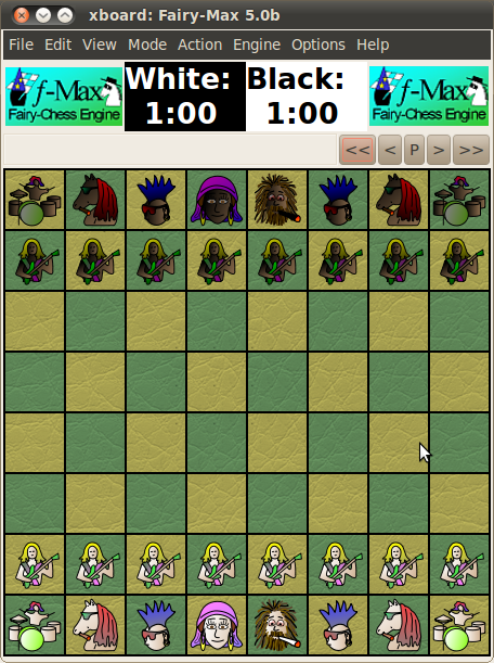
This is extremely subjective. The image you show above looks absolutely awful to me, to the point where it hurts my eyes to look at it. I would probably rate it one of the worst. Way too crowded.
I do see a lot of red squares with crosses in the various sub-windows, so I suppose these can be closed to ameliorate matters. Which is good, as I see a lot of stuff that would not be relevant to me, while other stuff (clocks, engine logos) seems to be missing. So perhaps it is a consequece of opening too much at the same time, so that my opinion would be more favorable if it was configured for a particular application, say an engine - engine game. What I consider attractive is a quiet, minimalistic design with as few distracting elements as possible. Something like:
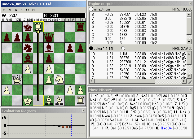
It has what I want to see, (board & clocks, engine ID, analysis and game navigation) and nothing else.
Specific things that for me count as a big minus are:
* The 'ribbon' along the top, which seems to have the function of a main menu, but selectable by tab rather than as a pull-down menu. It is cluttered with totally non-informative pictograms (of very inhomogeneous size). Just listing the explanative text in a small table, as a conventional pop-down menu would do, would already be enormously better.
* Much space wasted around the board, seemingly for no other purpose than fitting the bar of navigation buttons. That it can look nice to have a rim around the board (where you could for instance write the board coordinates), OK. WinBoard you can optionally do that too. But this doesn't look like a board rim at all, just like a board asymmetrically nailed to a wall. And it doesn't even seem room to show square coordinates.
* The buttens in the navigation bar are too conspicuous, and the pictograms on them non stadard. I have no idea what the blue curved arrow could mean.
* The engine names in the kibitz windows are written both in the window title bar and in the window directly below it. What's the point of that? Depth, score and move are written both at the top and at the bottom within the window. The way it is written at the top is ugly; it makes the window look inhomogeeous/irregular.
* The Notation - Openings Book window also has such an inhomogeneous header inside it; this seems a general design theme of this GUI that I don't like. It seems that the info there could have been easily put in the title bar, which seems now just to contain a fixed text. (Which, incidentally, doesn't see much to the point.)