My opinion is not very important because I don't use Winboard and
Arena very often. My main work was/is testing my own engine and
sometimes have a look at PGN games.
For me the engine interface is more important than the user interface.
My problems and observations with the GUIs are:
- Winboard looks a little bit too simple, Arena looks a little bit too chaotic.
- Chosing an engine or a group of engines was easier in Arena than in Winboard.
I wanted one or two versions of my engine play against a group of other engines over night.
A few hundred or thousand games from different positions.
I did this with Arena and automatic opening play from Arena.
- I do not like the color of the standard Winboard board. This yellowish greenish thing.
That does not look very natural. And not even modern.
- I am always confused with black and white. I mean there is a white
player name and a black player name written black on white or
white on black and always changing depending on who has the move.
Or was it just the black and white clock? However.
Could you please find another right of move marker and do not
mess with the player names? Perhaps the 2 logos and than the names written
in a neutral color on a background that fits to the board theme.
Perhaps one background a little brighter and the other a little darker.
Underline the player who has the move or give him a pawn icon
or an animated clock.
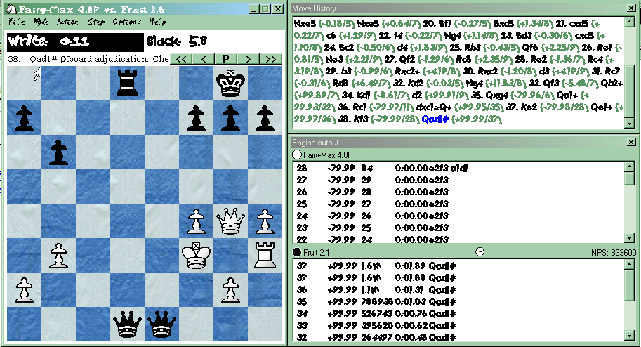
- The other place where I always get confused is the place where both
engines display their output. Or the GUI does this.
In the board most of the time black is on top and white is at the bottom
but in the log area this may be reversed. I need an easy marker
to see who is who. That may be the logo or a black/white king to the left
of this display area or something.
Sorry, I have no good solution.
Harald
Is "WinBoard look" obsolete?
Moderators: hgm, Rebel, chrisw
-
hgm

- Posts: 27822
- Joined: Fri Mar 10, 2006 10:06 am
- Location: Amsterdam
- Full name: H G Muller
Re: Is "WinBoard look" obsolete?
OK, here is a screenshot to show that the fonts are fully configurable. You will of course understand I prefer the default settings over this;it wasust to show something extreme.. 
The title-bars and menu fonts are of course configurable from the system control panel, as part of your Windows look. I prefer the 'Windows classic' theme, and this might already explain why screenshots I make look oldish.
The clock font, engine-output/move history, message field (above the board) are allconfigurablefrom the WinBoard Options->Fonts menu dialog.
-
hgm
- Posts: 27822
- Joined: Fri Mar 10, 2006 10:06 am
- Location: Amsterdam
- Full name: H G Muller
Re: Is "WinBoard look" obsolete?
The problem is that you install engines in the winboard.ini file. This is also why you need the editor. I never do that. I only install the engines once, in PSWBTM, and always run WinBoard from there. If you want to run it directly from the GUI, you are bringing it upon yourself. It offers no advantages I can see: you would have to go through the startup dialog in stead of going through PSWBTM, and the startup dialog is very limited.Jimbo I wrote:When I started playing with the new version, I realized that I still had to manually add lines to the Winboard.ini file with a text editor to install an engine. That meant I still had to manually futz with polyglot files, etc. Also, I discovered that if I wanted to run a tournament, I had to separately install the engine in the tournament manager. That's two installs for the same engine, if I want to be able to run the engine both in a tournament and directly in the GUI.
If there is a single engine that you want torun very often (e.g. your favorite analysis engine) the recommended way to invoke WinBoard with that engine would be a shortcut, not the startup dialog.
If you had to touch Polyglot files you were doing something wrong. With the new Polyglots you would never have to know they existed. You just configure the engine from the WinBoard menu, and press the save button for the settings.
-
Michel
- Posts: 2272
- Joined: Mon Sep 29, 2008 1:50 am
Re: Is "WinBoard look" obsolete?
Does PSWBTM allows one to do analysis? As I said my main problem is that in xboard I cannot switch engines during analysis.This is also why you need the editor. I never do that. I only install the engines once, in PSWBTM, and always run WinBoard from there.
PS. I notice that the license of PSWBTM has changed. It seems to be an open source license now (before it wasn't if I remember correctly).
-
michiguel

- Posts: 6401
- Joined: Thu Mar 09, 2006 8:30 pm
- Location: Chicago, Illinois, USA
Re: Is "WinBoard look" obsolete?
I personally do not care about this because I found what I liked. I customized xboard and I am happy with ithgm wrote:To not annoy the Arena team by trespassing in their thread, I continued this interesting discussion about WinBoard in a new thread:
OK, thanks. This, at last, is clear language. I will address it in a following post (with more screenshots!JuLieN wrote:Well, if I'm sure that you're open to suggestion, then I'll give it a shot. But keep in mind that it is JUST my opinion and my own taste, AND that I don't have a deep knowledge of Winboard. Ok, here we go :
1) my main concern is the cluttered windows. I prefer monolithic design (that is, everything in the same window. Which doesn't prevent you from configuring this space as you wish, adding a movelist section, removing the balance section, and so on (look at Fritz's interface for a good example of that). I guess I'm not the only one as, as I pointed out just a few posts ago, all the programs Apple rewarded last year were mono-windowed.
2) then the main window, by itself, is too spartan for my taste (this is the one you see first and, most of the time, the only one you see, and the one that makes me say that nothing changed in 15 tears). In particular, the top of the window, with its white/black bar and move go back/go forward under it looks soooooo x11/win95... No, actually it reminds me of win31 programs. A suggestion would be to extend this window, putting the board on the left and the remaining informations on the right (all other chessinterfaces do that, actually, do there's plenty of examples).
3) The menu. I like Arena's one : it's packed with functions, and well organized. I always know where to search. I think you should have at least a Position and a Modules entries in the main menu, at the same level as File and Options.
4) Icon bar... well... I'm not a big fan of it. Apart for a few of them (like the one for "new game" or "analyze", I rarely use them in Arena, as I always use the menus (besides, I use Arena as a programer, to test my engine, not as a chess player, so my user experience and needs differ). BUT, they do make the program look fine and modern, and I guess many users make good use of them. But some programs exagerate with them. For instance, I really dislike the mess the Fritz 12's ribbon is.
5) All the little details. For instance, the fonts on all of your screenshot look so old. And the main theme (green and white) is just ugly, imho. The default theme MUST be perfect, as this will be the only one most user will see and use. And excess is a plague, too. For instance i'm not a big fan of Aquarium.
6) make all of those 5 previous points configurable. For instance, some people might like clustered windows, so make it an option (some programs do that, though none amongst chess programs). Why not adding a "theme" function, btw. Some people just love to polish interfaces and make their work available to others. You could start with having everything changeable through an xml file, for instance (just a suggestion, as I know some programs that do that).
So, here were a few suggestions to start with. I hope you now understand better what I meant, and that it will be usefull.), but I can say right away that much of what you mention has already been done, and is more a matter of configuring than redesigning. E.g. all fonts (typeface, point size, attributes, colors) are fully configurable by the user, independenly for most windows. You are probably just not aware of it. More later (after I made the screenshots).
http://sites.google.com/site/gaviotache ... figuration
However, I do not believe that it is a coincidence that many people do not like the default colors. This is of course subjective, but IMHO, they do not have a smooth contrast that it is easy on the eyes. Hard to reach with yellow and green.
People are generally heavily influenced by first impressions, so not caring about the default colors is not a good strategy even if it could be changed. I suggest to run a poll with a handful of alternatives and choose that.
Miguel
-
hgm
- Posts: 27822
- Joined: Fri Mar 10, 2006 10:06 am
- Location: Amsterdam
- Full name: H G Muller
Re: Is "WinBoard look" obsolete?
I still promised to discuss this one, but I was a bit busy yesterday with the on-line blitz tourney.
So the WinBoard design is simply upward compatible with the 'monolithic' design: you can do everything that you can do with the latter, but you can also do things that the monolithic design cannot. Because of the way the windows dock, WinBoard behaves pretty much as a single-window application. So the user has the best of both worlds.
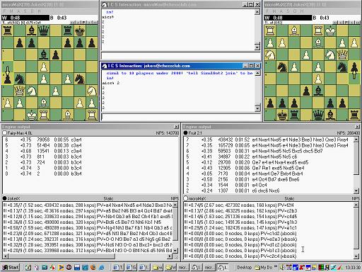
I will most certainly never leave that design. The ability to separate the windows and tile them independently is something I use very often, and IMO the main feature that makes WinBoard so superior to other GUIs. Other WinBoard users have been confirming that, sometimes stating it is the only reason they use WinBoard. E.g look at my usual screen layout for the on-line blitz tourney; this would be very hard to do with any other GUI:
That being said, there is of course room for improvement in the way the resizing of windows would affect each other. The current design positions the conglomerate docked windows as if it is monolithic (albeit with a delay; current-day PCs and video cards would be fast enough todo that in real time, and perhaps I should change to that). But on sizing it does not subtract any size increase of the board window from the corresponding dimension of the docked auxiliary windows (like a splitter would do). It just moves these windows, grabbing more size for the total. This is mainly because I suppose it is desired behavior. But is might not be if it pushes the outer edges of the conglomerate off screen. So perhaps it would be an improvement if the behavior was changed in that case to a total-size-consrving one.
Grabbing a 'pseudo-splitter' on the side of the auxiliary window does not couple to the bordering window even when it is docked, and is used to break the docking (making the windows overlap or greating a gap). This could be changed too: undocking could be limited to the case where you grab the auxiliary window by its title bar. Currently the implied attempt to expand or eat away space from the board window would fail because of the way resizing events of that window are interpreted: because of the restriction that the aspect ratio of the board should remain fixed, it finally sizes to the largest board that fits in the indicated window size, shrinking the superfluously large dimension back. So dragging one edge of the board outwards now never has any effect, and you have to expand by dragging a corner. But as the software knows which edge you are dragging, this could of course be changed: it could unconditionally adopt the size in the altered dimension, and enlarge any not-fitting untouched dimension, rather than shrink the altered dimension back.
Any suggestions for what should be the intended behavior here are welcome.
Actually, I think the clocks are in a very well-chosen place. Having them besides the board would be really awkward, as they are wide rather than high, and waste enormous amounts of space. The main problem with the clocks is that there is no intuitive association between clock and player: the clocks are left and right, the players top and bottom. (But for OTB play this is actually good.) This could be solved by displaying one clock above, the other below the board. Even this would waste some vertical space, though, as it is not clear if there would be any use for the area next to the clocks, if they are not next to each other. I considered this in connection with the displaying of engine logos, but the problem isthata clock is in general much smaller than you would want an engine logo to be.
Either way, I see no merit at all in the way Arena positions the clocks. They are still next to each other. The clocks could of course be put in their own window, so that the user could position them in whatevertiling he thinks best. (It seems that Shredder Classic has this.)
Any suggestions?
I admit that the highlighting of the clock is totally ambiguous, and initially confused me as well (until I realized that blackletters on white background is the unhighlighted state). I have been considering doing the highlighting by drawing a border around the clock of the stm. Downside is that a border takes extra space, while reversing the video is completely free. Alternative would be to write some symbol in the field of the stm clock (e.g. a dot, which does not take vertical space).
Now of course I usually decide whose move it is by which clock I actually see decrementing. So the ambiguity is really only relevant in unclocked modes. In those modes there is no time to display, so there is indeed space enough to print some stm indicator (like an asterisknext tothe words White or Black).
Another option would be to always print an stm indicator in themiddle between the clocks, like a blackon white circle that is open when white has the move, and filled when black has the move. Perhaps there would also be room for a 50-move counter there, which is actually the feature I am missing most myself (but have not implemented yet because I could not think of a suitable place to put it).
The button bar is optional, and perhaps I should disable it by default. I really see very little use for this element: the arrow keys on the keyboard perform exactly the same function.
I must admit that I have absolutely no clue what I would find in a 'Module' menu, this is not an intuitive or descriptive name. As to a 'Position' main menu: I am not sure why 'position' should be singled out above 'game'. The current menu items havea high symmetry between actonson positions and on games (e.g. load, save, next, prev, copy, paste). What is more a breach of convention in the current organization is that copy and paste are in the file menu, rather than in a separate 'Edit' menu. So IMO grouping Copt Game, Paste Game, Copy Position, Paste Position, Copy Game List in a new Edit menu would make a much more intuitive organization then having a 'Position' menu. (What would you want to be in there anyway?) I am wondering where the items 'Edit Game' and 'Edit Position' shouldgo in that case; I would hateto remove them from the 'Mode' menu, since that is so obviously wherethey belong, amongst the other modes. Perhaps they should be duplicated, to appear both in the Edit and Mode menu?
 The "defaults" button in the Board Options dialog comes in very handy then, but you can only use it to make it suitable for Chess. But you would have lost any non-default settings you wanted for Chess, and there is no shortcut for switching back to Shogi afterwards. So it would be useful to have multiple themes to recall. I solve that nowby creative use of the very flexible configurability of WinBoard, creating shorcuts that use WinBoard with different ini files: one for Shogi, one for Xiangqi, one for Gothic Chess...
Technically speaking, everything is a window, even a simple button. So any design will consist of a bunch of windows. The difference is just in what kind of manipulation the software allows the user to do to window size and position through mouse actions. With floating windows you can do everything, even separate them, for fully independent tiling. Splitters are window edges you can move, to resize the windows that touch in that place,but you cannot separate them. Buttons you usually cannot drag or size at all.JuLieN wrote:Well, if I'm sure that you're open to suggestion, then I'll give it a shot. But keep in mind that it is JUST my opinion and my own taste, AND that I don't have a deep knowledge of Winboard. Ok, here we go :
1) my main concern is the cluttered windows. I prefer monolithic design (that is, everything in the same window. Which doesn't prevent you from configuring this space as you wish, adding a movelist section, removing the balance section, and so on (look at Fritz's interface for a good example of that). I guess I'm not the only one as, as I pointed out just a few posts ago, all the programs Apple rewarded last year were mono-windowed.
So the WinBoard design is simply upward compatible with the 'monolithic' design: you can do everything that you can do with the latter, but you can also do things that the monolithic design cannot. Because of the way the windows dock, WinBoard behaves pretty much as a single-window application. So the user has the best of both worlds.
I will most certainly never leave that design. The ability to separate the windows and tile them independently is something I use very often, and IMO the main feature that makes WinBoard so superior to other GUIs. Other WinBoard users have been confirming that, sometimes stating it is the only reason they use WinBoard. E.g look at my usual screen layout for the on-line blitz tourney; this would be very hard to do with any other GUI:
That being said, there is of course room for improvement in the way the resizing of windows would affect each other. The current design positions the conglomerate docked windows as if it is monolithic (albeit with a delay; current-day PCs and video cards would be fast enough todo that in real time, and perhaps I should change to that). But on sizing it does not subtract any size increase of the board window from the corresponding dimension of the docked auxiliary windows (like a splitter would do). It just moves these windows, grabbing more size for the total. This is mainly because I suppose it is desired behavior. But is might not be if it pushes the outer edges of the conglomerate off screen. So perhaps it would be an improvement if the behavior was changed in that case to a total-size-consrving one.
Grabbing a 'pseudo-splitter' on the side of the auxiliary window does not couple to the bordering window even when it is docked, and is used to break the docking (making the windows overlap or greating a gap). This could be changed too: undocking could be limited to the case where you grab the auxiliary window by its title bar. Currently the implied attempt to expand or eat away space from the board window would fail because of the way resizing events of that window are interpreted: because of the restriction that the aspect ratio of the board should remain fixed, it finally sizes to the largest board that fits in the indicated window size, shrinking the superfluously large dimension back. So dragging one edge of the board outwards now never has any effect, and you have to expand by dragging a corner. But as the software knows which edge you are dragging, this could of course be changed: it could unconditionally adopt the size in the altered dimension, and enlarge any not-fitting untouched dimension, rather than shrink the altered dimension back.
Any suggestions for what should be the intended behavior here are welcome.
Hmm, I am starting to wonder which version you are using then. For me, multiple windows always pop up for almost anything I do...2) then the main window, by itself, is too spartan for my taste (this is the one you see first and, most of the time, the only one you see,
Somehow I fail to see why the positioning of the clocks would suggest a certain era. I would think you put the clocks in what is the most convenient place forit, and that you would do that both in the stone age and in the year 2525. It is not that there ever has been a technical limitation as to where to put the clocks.... and the one that makes me say that nothing changed in 15 tears). In particular, the top of the window, with its white/black bar and move go back/go forward under it looks soooooo x11/win95... No, actually it reminds me of win31 programs. A suggestion would be to extend this window, putting the board on the left and the remaining informations on the right (all other chessinterfaces do that, actually, do there's plenty of examples).
Actually, I think the clocks are in a very well-chosen place. Having them besides the board would be really awkward, as they are wide rather than high, and waste enormous amounts of space. The main problem with the clocks is that there is no intuitive association between clock and player: the clocks are left and right, the players top and bottom. (But for OTB play this is actually good.) This could be solved by displaying one clock above, the other below the board. Even this would waste some vertical space, though, as it is not clear if there would be any use for the area next to the clocks, if they are not next to each other. I considered this in connection with the displaying of engine logos, but the problem isthata clock is in general much smaller than you would want an engine logo to be.
Either way, I see no merit at all in the way Arena positions the clocks. They are still next to each other. The clocks could of course be put in their own window, so that the user could position them in whatevertiling he thinks best. (It seems that Shredder Classic has this.)
Any suggestions?
I admit that the highlighting of the clock is totally ambiguous, and initially confused me as well (until I realized that blackletters on white background is the unhighlighted state). I have been considering doing the highlighting by drawing a border around the clock of the stm. Downside is that a border takes extra space, while reversing the video is completely free. Alternative would be to write some symbol in the field of the stm clock (e.g. a dot, which does not take vertical space).
Now of course I usually decide whose move it is by which clock I actually see decrementing. So the ambiguity is really only relevant in unclocked modes. In those modes there is no time to display, so there is indeed space enough to print some stm indicator (like an asterisknext tothe words White or Black).
Another option would be to always print an stm indicator in themiddle between the clocks, like a blackon white circle that is open when white has the move, and filled when black has the move. Perhaps there would also be room for a 50-move counter there, which is actually the feature I am missing most myself (but have not implemented yet because I could not think of a suitable place to put it).
The button bar is optional, and perhaps I should disable it by default. I really see very little use for this element: the arrow keys on the keyboard perform exactly the same function.
I agree that the menu sub-division is not as I would design it from scratch, but has evolved by historic accident. The main thing that strikes me as odd is that the opening and closing of display windows is done from the 'Mode' menu; IMO it would be more logical to have a separate 'Configuration' menu for that. The File menu also contains some items I never use, like "Next Game", "Previous Game". I wonder if these items are not just a remnant from the era before there was a game list, and could be safely removed now there is one.3) The menu. I like Arena's one : it's packed with functions, and well organized. I always know where to search. I think you should have at least a Position and a Modules entries in the main menu, at the same level as File and Options.
I must admit that I have absolutely no clue what I would find in a 'Module' menu, this is not an intuitive or descriptive name. As to a 'Position' main menu: I am not sure why 'position' should be singled out above 'game'. The current menu items havea high symmetry between actonson positions and on games (e.g. load, save, next, prev, copy, paste). What is more a breach of convention in the current organization is that copy and paste are in the file menu, rather than in a separate 'Edit' menu. So IMO grouping Copt Game, Paste Game, Copy Position, Paste Position, Copy Game List in a new Edit menu would make a much more intuitive organization then having a 'Position' menu. (What would you want to be in there anyway?) I am wondering where the items 'Edit Game' and 'Edit Position' shouldgo in that case; I would hateto remove them from the 'Mode' menu, since that is so obviously wherethey belong, amongst the other modes. Perhaps they should be duplicated, to appear both in the Edit and Mode menu?
OK, I guess we feel the same aboutthis. I also dislike crowded toolbars. People often propose to make a toolbar in WinBoard, and I always tell them "well, go ahead, as long as it can be switched off". (Of course they never do anything if it turns out they have to do it themselves...)4) Icon bar... well... I'm not a big fan of it. Apart for a few of them (like the one for "new game" or "analyze", I rarely use them in Arena, as I always use the menus (besides, I use Arena as a programer, to test my engine, not as a chess player, so my user experience and needs differ). BUT, they do make the program look fine and modern, and I guess many users make good use of them. But some programs exagerate with them. For instance, I really dislike the mess the Fritz 12's ribbon is.
As I have shown above in the screenshot, the fonts easily can be configured to be any font you have on your system (i.e. through a menu dialog). Just as board and pieces. This is the first time, however, I hear complaints about the default font. What puzzles me is this: I can imagine that it would be far to difficult for most people to patch the C-code. But even the average idiot should be able to _configure_ WinBoard with a nice color scheme, fancy fonts, etc. It only requires operating the menus, and saving the settings at the end (which is usually automatic anyway). But no one ever does that. Hence my impression that most people must thinkit the defaults are perfect...5) All the little details. For instance, the fonts on all of your screenshot look so old. And the main theme (green and white) is just ugly, imho. The default theme MUST be perfect, as this will be the only one most user will see and use. And excess is a plague, too. For instance i'm not a big fan of Aquarium.
Themes are defenitely something worth considering, especially in combination with variants: it often happens you would want one board texture and pieces in one variant, where the same settings completely wreck the other variant. E.g. to do Shogi in traditional oriental representation, you need to tick "all white" to have 'black' use the outline pieces, "flip black" to display them upside down, make the 'black' pieces white, make the light and dar squares the same color. And then when you switch back to Chess black plays with upside-down white pieces!6) make all of those 5 previous points configurable. For instance, some people might like clustered windows, so make it an option (some programs do that, though none amongst chess programs). Why not adding a "theme" function, btw. Some people just love to polish interfaces and make their work available to others. You could start with having everything changeable through an xml file, for instance (just a suggestion, as I know some programs that do that).
-
hgm
- Posts: 27822
- Joined: Fri Mar 10, 2006 10:06 am
- Location: Amsterdam
- Full name: H G Muller
Re: Is "WinBoard look" obsolete?
I don't think there are any restrictions on what PSWBTM allows WinBoard to do (as it only controls WB through its command-line options, which can be changed through the menus). Just select the engine, launch it,and select 'Analysis' in the WB Mode menu.Michel wrote:Does PSWBTM allows one to do analysis? As I said my main problem is that in xboard I cannot switch engines during analysis.This is also why you need the editor. I never do that. I only install the engines once, in PSWBTM, and always run WinBoard from there.
PS. I notice that the license of PSWBTM has changed. It seems to be an open source license now (before it wasn't if I remember correctly).
-
hgm
- Posts: 27822
- Joined: Fri Mar 10, 2006 10:06 am
- Location: Amsterdam
- Full name: H G Muller
Re: Is "WinBoard look" obsolete?
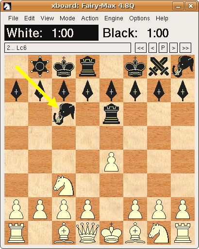
What I always disliked in the XBoard pixmap customizing, is that all squares of one color look exactly the same. The human eye is very sensitive to this, and it does make it look primitive and cheap. The board texturing allowed by WinBoard (independent of the piece rendering) really makes a much better impression. So I am happy that XBoard now supports that too. My favorite theme is the fine-grained wood:michiguel wrote:I personally do not care about this because I found what I liked. I customized xboard and I am happy with it
http://sites.google.com/site/gaviotache ... figuration
-
Michel
- Posts: 2272
- Joined: Mon Sep 29, 2008 1:50 am
Re: Is "WinBoard look" obsolete?
But then if you want another engine you would presumably restart Winboard through PSWBTM and then you would have to reload the fen (or do some copy pasting). This is more convoluted than just loading an engine from a menu within xboard (without touching the currently displayed game or position).Just select the engine, launch it,and select 'Analysis' in the WB Mode menu.
-
hgm
- Posts: 27822
- Joined: Fri Mar 10, 2006 10:06 am
- Location: Amsterdam
- Full name: H G Muller
Re: Is "WinBoard look" obsolete?
Indeed, it would be desirable if engines could be changed from the menu. All I meant to say with my answer to Michel is that using PSWBTM in no way limits you using it. WinBoard / XBoard can also not change engine when you start it directly from the comamnd line.
Abolishing the startup dialog, and having engines loadable from the menu is also on my wish list. Unfortunately it is not an easy change, as the initialization code for engine en WinBoard are thoroughly mixed. So the code would first have to be separated, so that you won't automatically reset WinBoard when loading an engine (thus defeating the purpose of not having to restart it).
I actually started working on this some time ago, and I do have a version of WinBoard that pops up the startup dialog through a menu item, (File -> Load Engine) rather than at startup. But one of the problems is that with the engine line you usually also give a number of WinBoard options, (like /fd, but also /fUCI, /firstXBook, /variant, /zp are quite common) that now only perform their effect in the WinBoard initialization code. So you cannot skip the WinBoard initialization code altogether, and it really requires some delicat thinking to decide what should be re-initialized, and what should be left alone. I guess you would like to keep the game / current position alone, but what if someone loads an engine that tries to set another variant? I guess you don't want to forbid that, but you would have no choice but resetting the game if you did.
The version I have just redoes the complete initialization, which is not what you would want, because it really resets every setting change you made through the user interface, as it also reloads the winboard.ini file. And you cannot always save it first, because save settings on exit might be off, and you don't want to change the ini file then. Of course I could save on a temporary ini file, and reload that. But that still leaves the question what to do with the volatile options. Often these are engine-associated, e.g. /fUCI or /firstXBook, and you definitely want to reset those. But /variant and /lgf are also volatile, and those you might want to keep. So it is a really messy problem.
Things were further compounded by the fact that I wanted to allow loading of a third engine, to play tree matches. At some point it became so complex that I turned to other matters, which could produce results quicker...